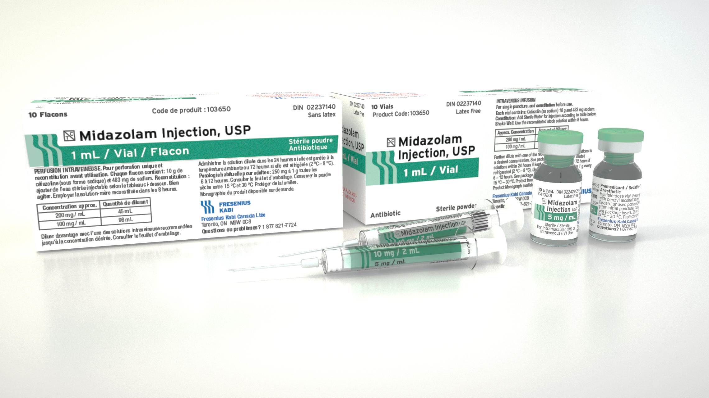
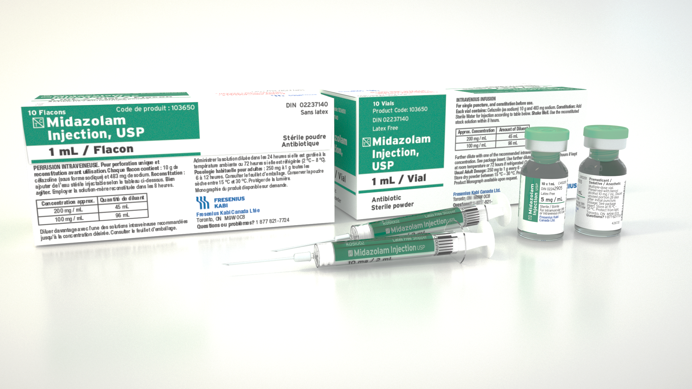
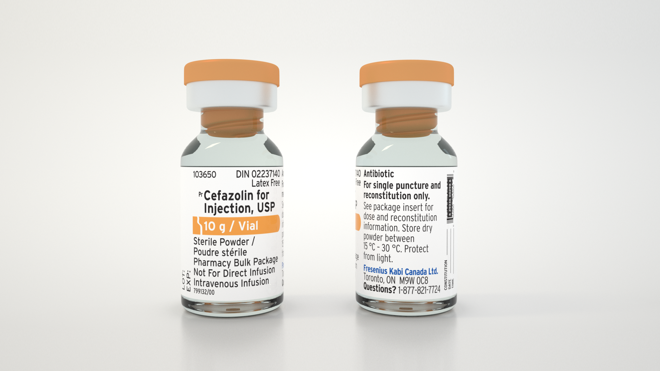
Fresenius Kabi Labelling
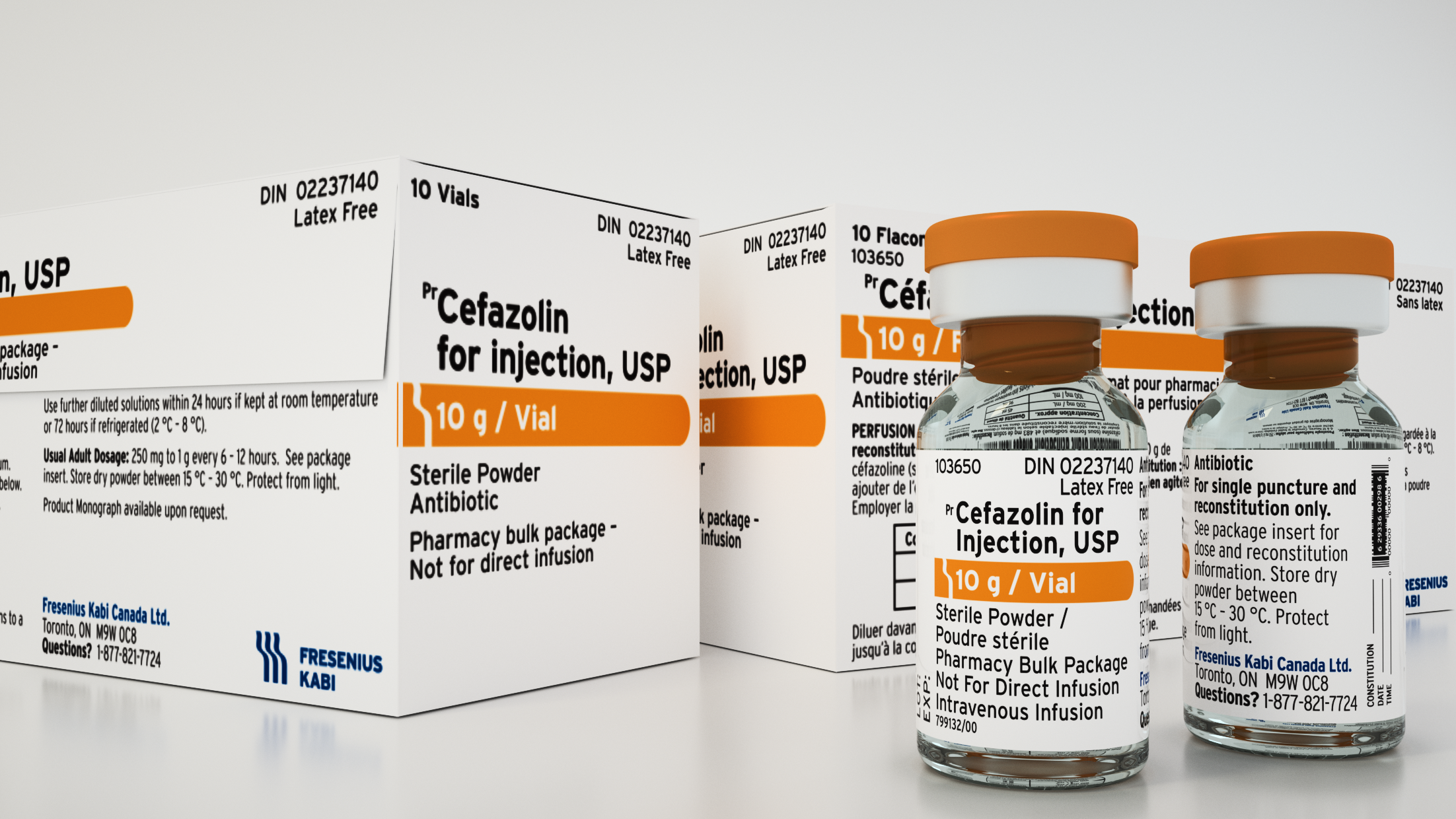
This project was to redesign the client’s labelling catalog to be compliant with Health Canada’s Plain Language Labelling Guidelines.
Aside from the regulations, the new design will also need a focus on readability. Not only does information need to be conveyed quickly and accurately but it also needs to be delivered efficiently as the primary users are tired nurses working 10 hour shifts.
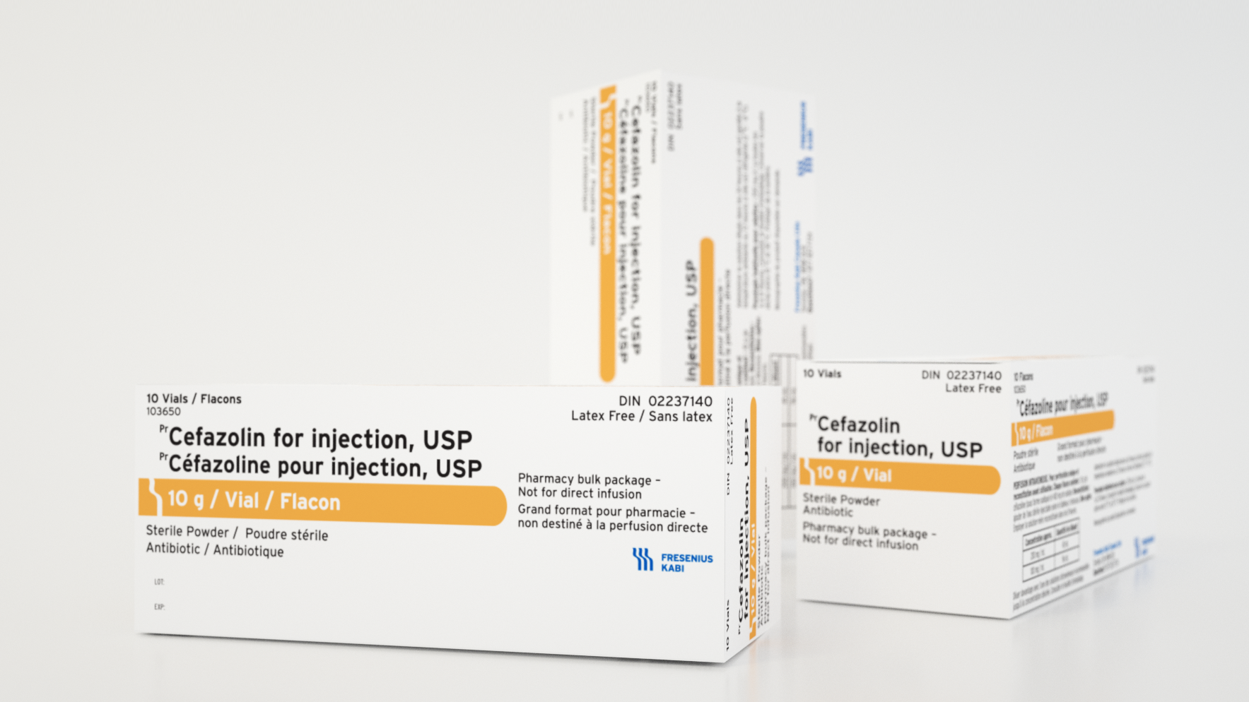
As we reviewed the client’s entire product line we noticed several glaring inconsistencies between their different components, products, and even strengths. Not only did we need revise their designs to be PLL compliant but we need to create a design system to unify their entire catalog.
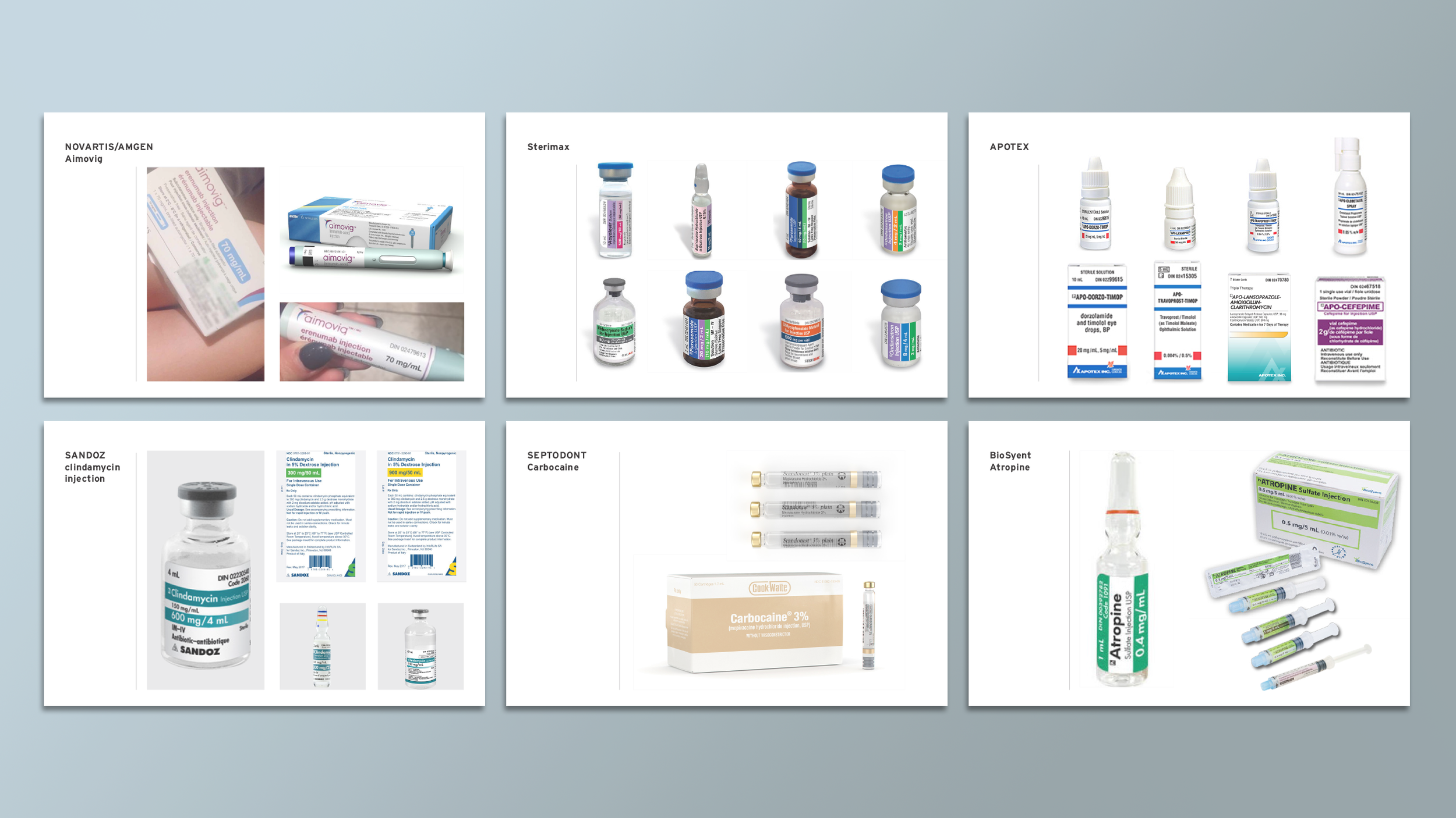
We preformed an audit of competitors to get a better understanding of the different designs currently on the market. Identified the strength bar as the primary visual in most of the designs we reviewed.